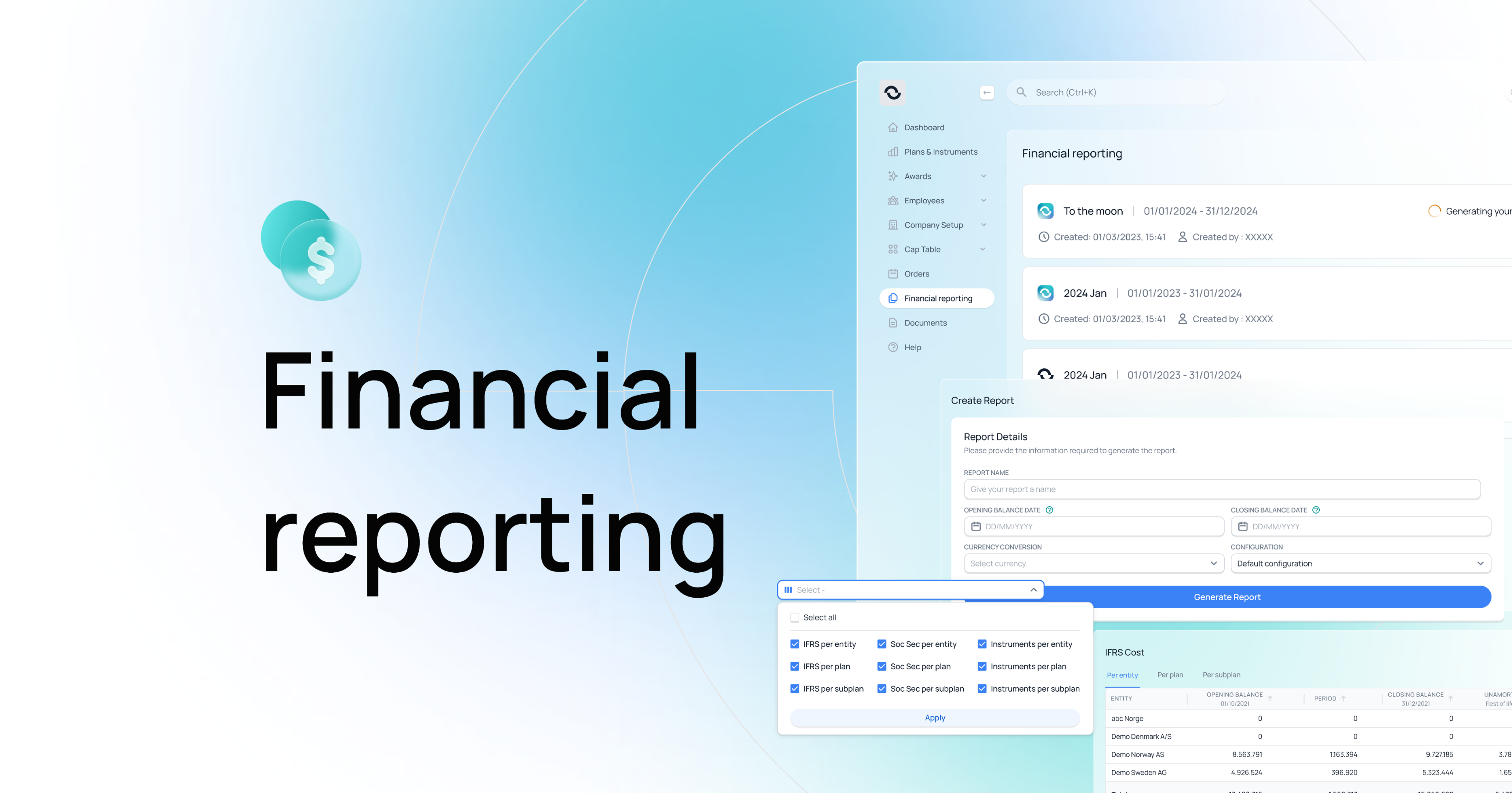
A guided report flow built into the product
Finance picks the period and the system fills the rest — values, rules, breakdowns. The same surface handles every report type the team has to file.

Every month, finance teams at our client companies had to file a report on their share programs. The numbers lived in the product. The reporting work didn't. People would export the data, paste it into Excel, apply the rules by hand, and send the file out. One missed value held up the whole month. Customer Success was on call to rebuild the spreadsheet every time something changed.
“If a screen is asking a finance team to do mechanical work the system could do, the design isn't finished.”
Finance picks the period and the system fills the rest — values, rules, breakdowns. The same surface handles every report type the team has to file.
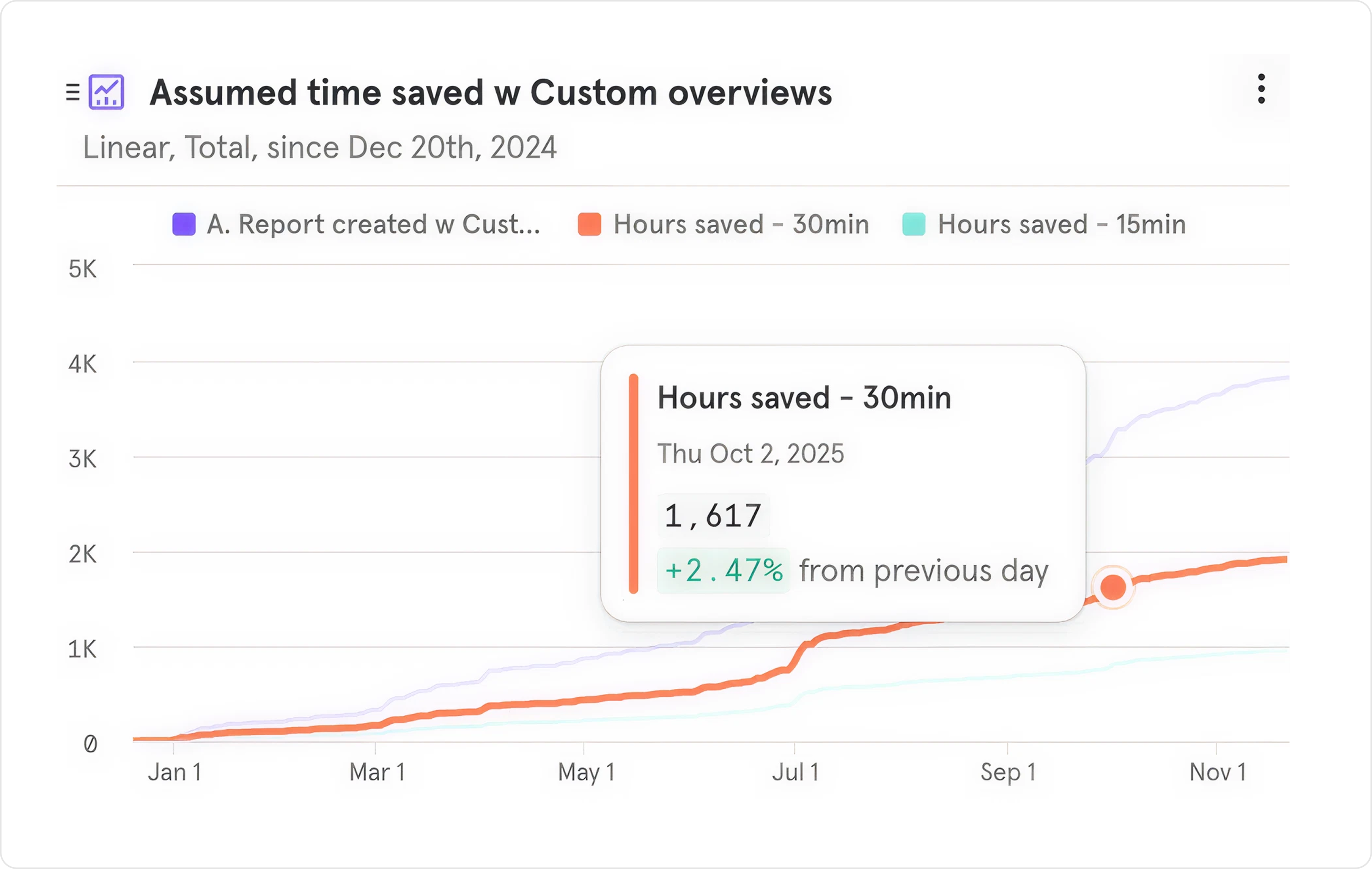
Each client groups their report differently. The old workflow handled this in Excel. I designed a grouping pattern that lives in the product, so the same setup carries across every month. Removed about 1 000 hours/year of manual Excel work.
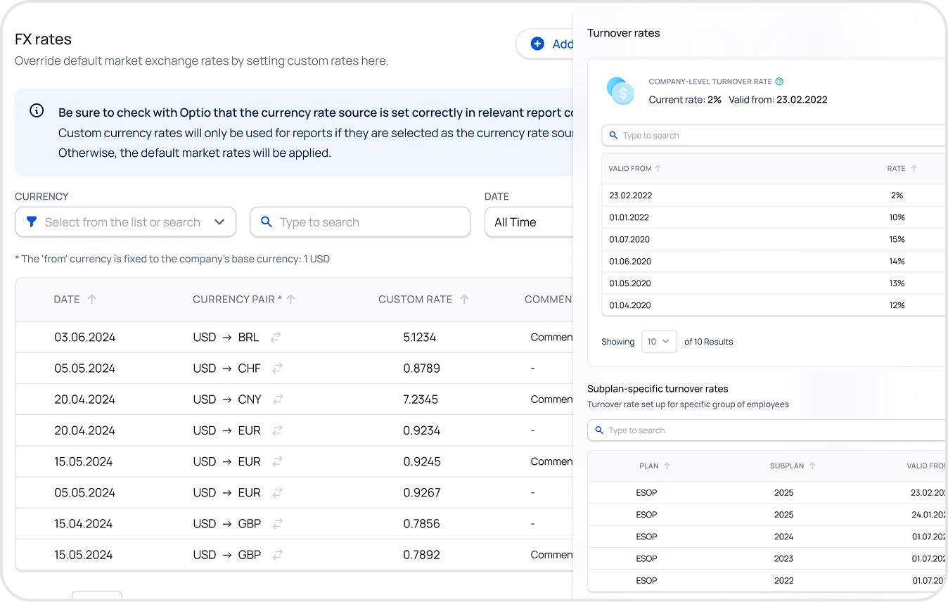
Custom currency rates and country-specific overrides used to be fixed by hand. I designed a permission-aware setup with validation and safe defaults, so finance can change a rate without opening a spreadsheet.
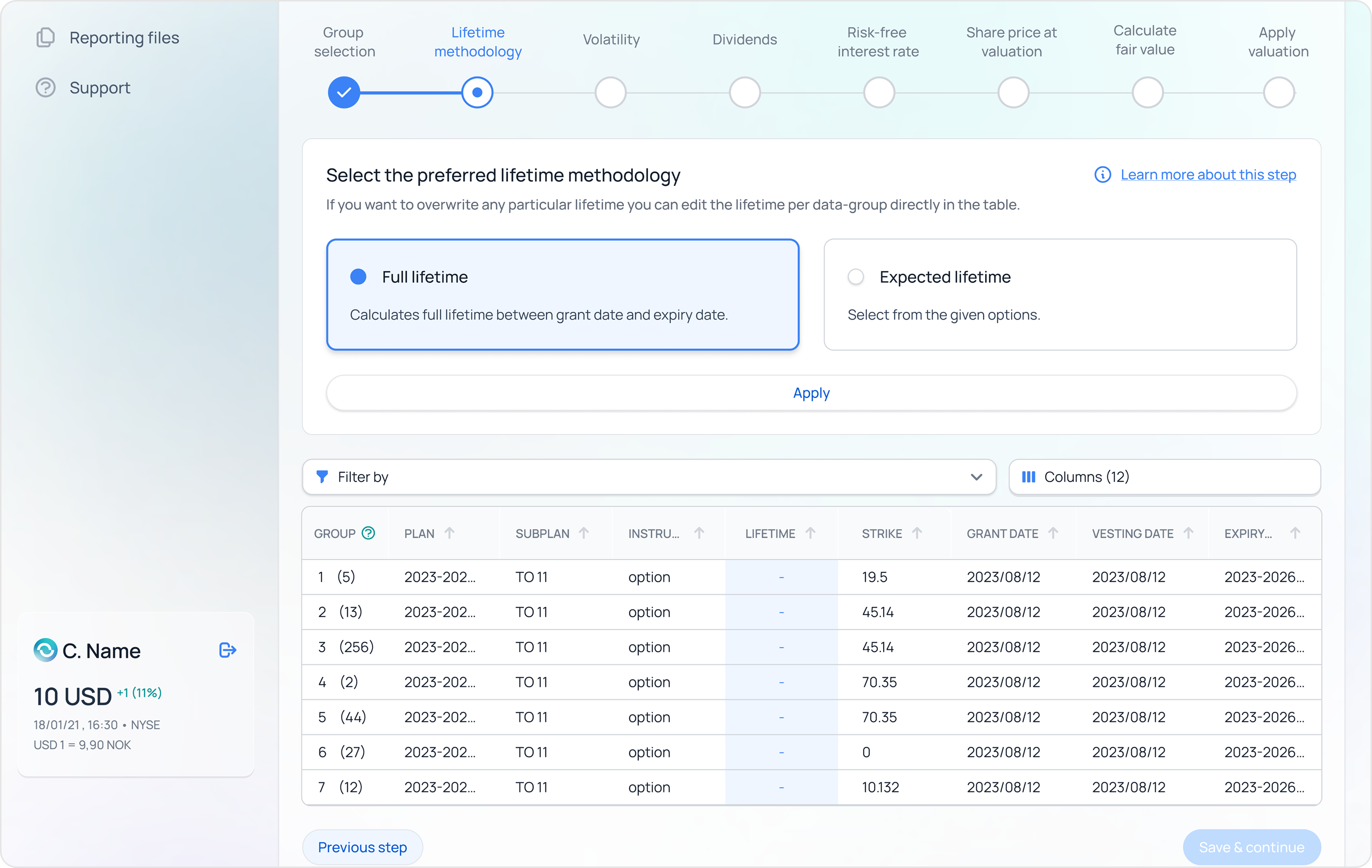
Working out what shares are worth on paper used to mean hiring an outside expert. I designed a guided flow with inline explanations, visible formulas, and history/comparison views — so company admins can run it themselves and trust the result.
What I rejected — AI-drawn UI explorations. In a domain where a misnamed field can break a report, the cost of a wrong label was bigger than the time AI saved drawing it.
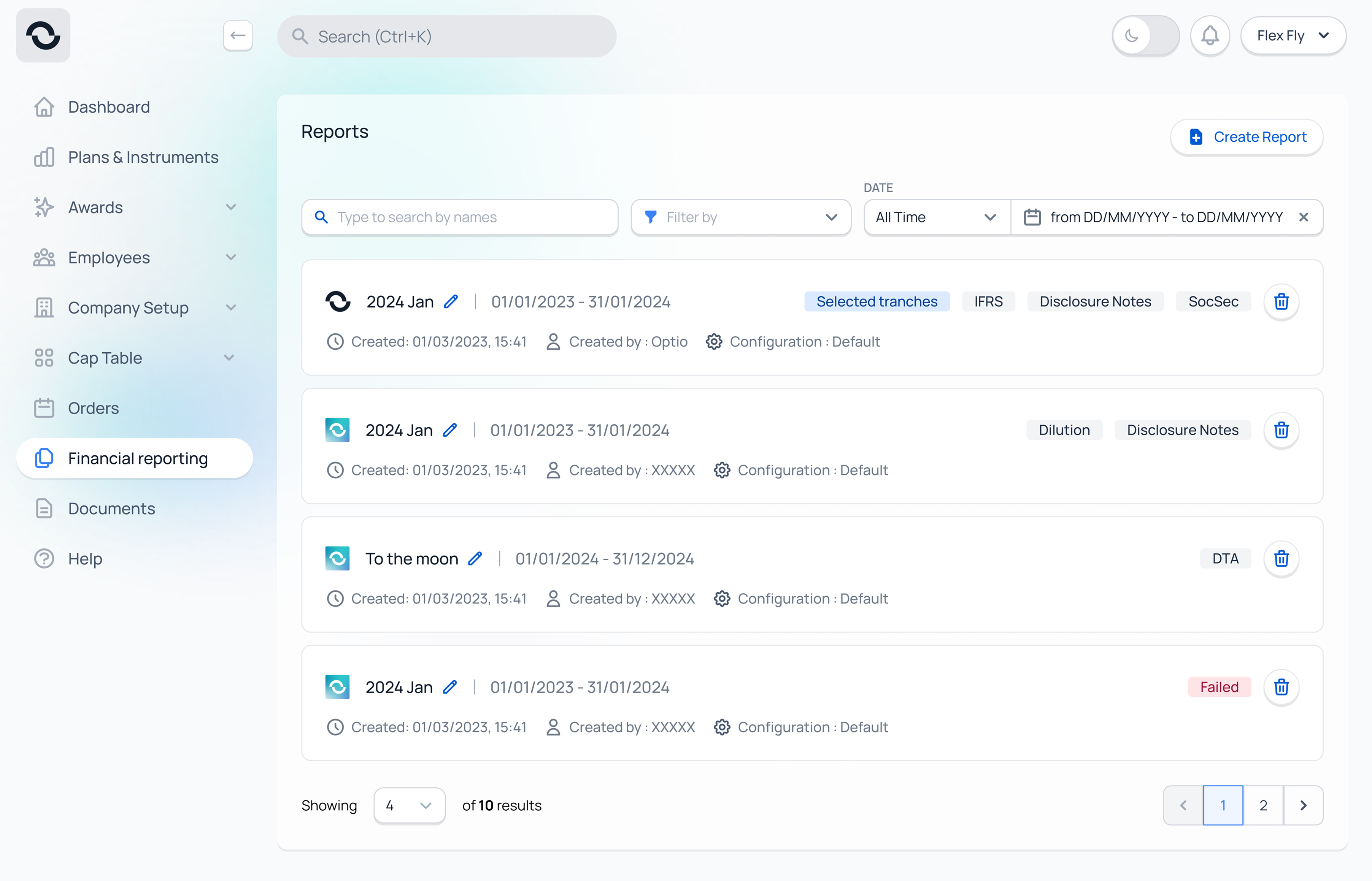
The reports list could have used a third-party table — sortable columns, dense rows, the format finance admins live in. I replaced it with cards instead. Cards matched the rest of the product, and consistency felt like the responsible choice.
I was optimising for the wrong thing. The audience here is admin super-users who work in tables all day. They needed capability over consistency — sort columns, scan rows, act. The right call would have been to keep the table, accept the design-system deviation, and document the exception. That's the decision I'd make now.
New reporting tools live across the platform — built in the product, not in Excel.
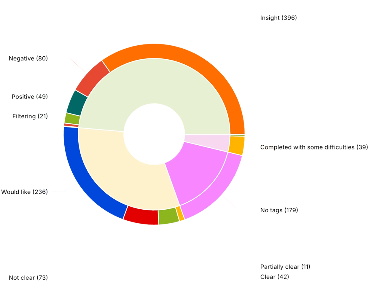
Manual Excel work removed by reusable grouping — measured by an in-product time-saved chart since Dec 2024.
Average time per process saved on adjacent Customer Success backoffice work.
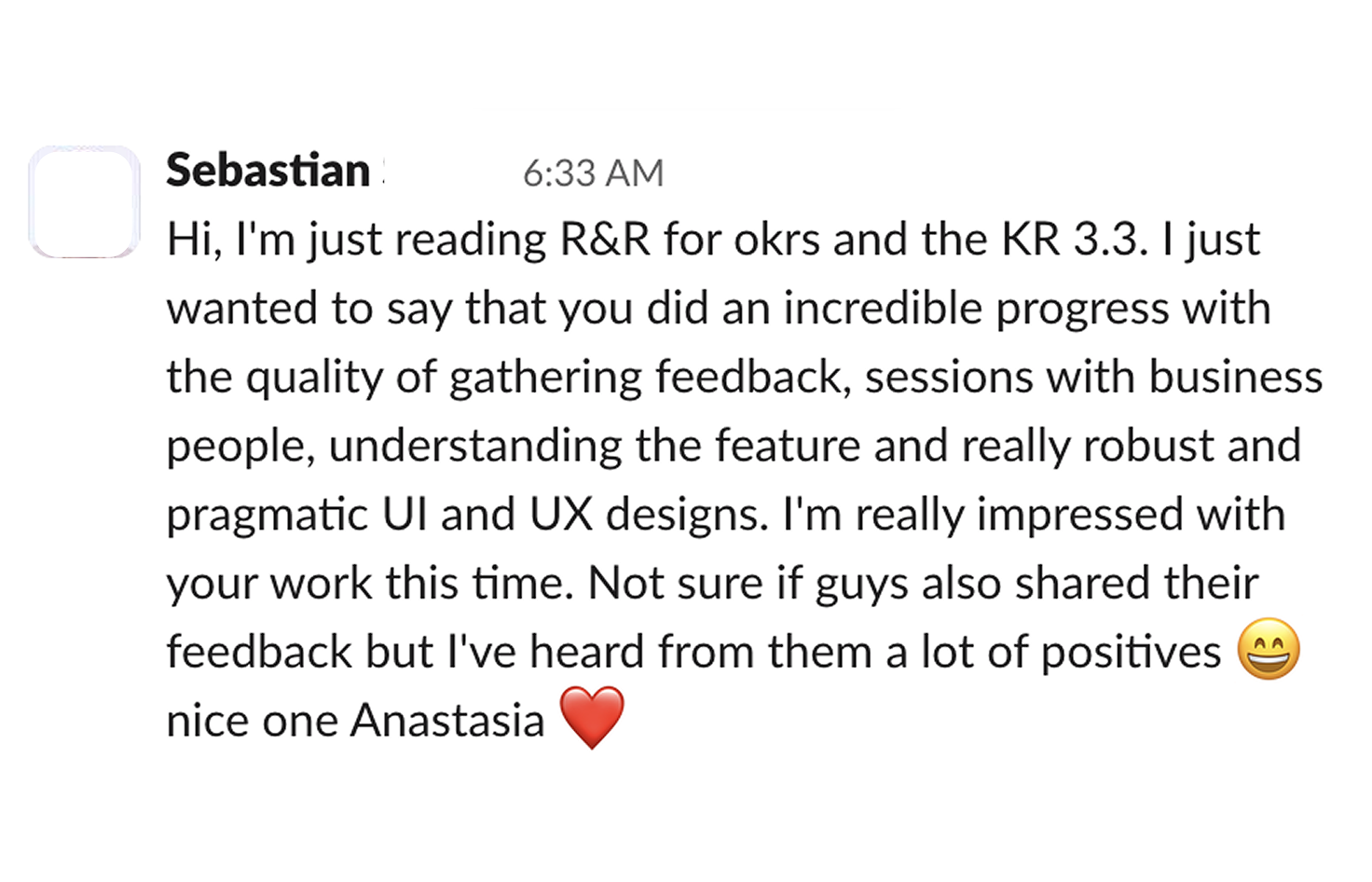
“I just wanted to say that you did an incredible progress with the quality of gathering feedback, sessions with business people, understanding the feature, and really robust and pragmatic UI and UX designs. I've heard from them a lot of positives — nice one, Anastasiia.”